THOUGHT LEADERSHIP
Jul 8, 2025
Neil Patel
12 Minutes
AI-Native User Interfaces: Foundational Principles
AI is rapidly redefining how we interact with software. Traditional graphical user interfaces (GUIs) built around nouns (menus, buttons, forms, and other static elements) are giving way to AI-driven interactions and automations focused on outcomes and actions. Instead of manually clicking through interfaces, users increasingly tell the computer what outcome they want and let intelligent algorithms handle the execution (Nielsen, 2023).
This shift raises new challenges and opportunities for designers: how to introduce novel AI capabilities while maintaining a predictable, trustworthy user experience. In this article, we explore four key principles shaping AI-native UI design: the move from noun-based to action-based interfaces, the balance between novelty and familiarity, the role of feedback and transparency, and the trade off between fidelity and immediacy, with examples from cutting-edge tools.
From Nouns to Verbs: A New Paradigm
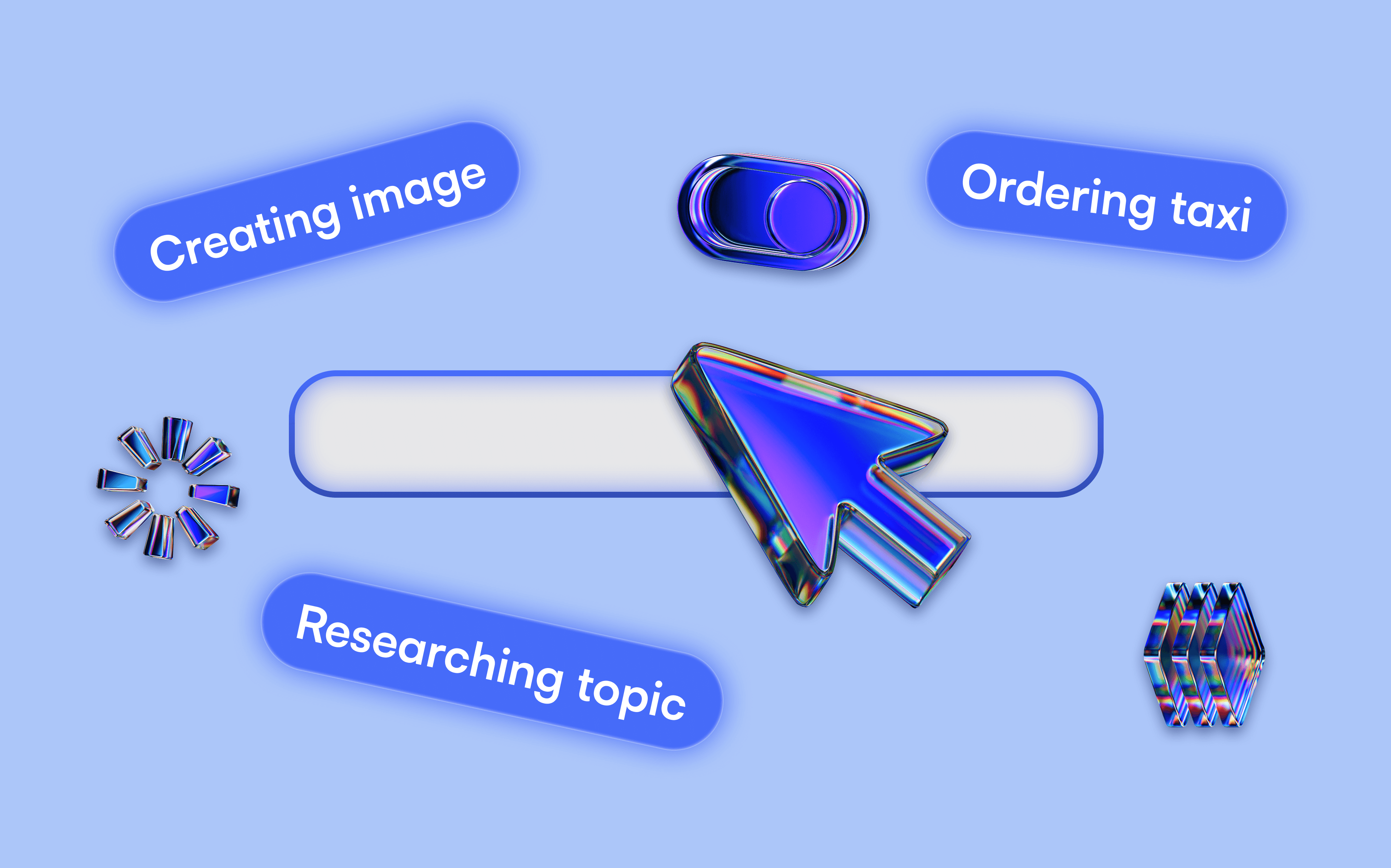
Traditional software UIs have been dominated by visible objects (files, buttons, form fields) and the principle of direct manipulation – users achieve goals by performing step-by-step commands on these noun-like interface elements. In an AI-native interface, this paradigm is flipped. Interaction becomes verb-centric: users express what they want to do (often in natural language), and the system handles the low-level operations. Nielsen (2023) describes this as a new “intent-based” paradigm where “users tell the computer the desired result but do not specify how this outcome should be accomplished,” reversing the locus of control from the user to the AI (Nielsen, 2023). In other words, the user declares an intention, and the system figures out the procedure.
Real-world examples illustrate this shift. ChatGPT and other generative chatbots let the user simply request an action or output, rather than navigating menus or manually executing each step. A task that might have required many clicks and actions can now be achieved with one well-phrased prompt. This approach also reduces a technical barrier preventing people from executing their ideas; they no longer need to learn advanced software tools. For instance, imagine prompting an image AI to create a complex sci-fi illustration versus using a graphics editor like Photoshop; the difference is clear, as seen in figure 1 which highlights the difference in UI between Adobe Photoshop (traditional) and Adobe Firefly (AI-native).

Figure 1: Comparison between noun and verb-based UIs. Adobe Photoshop UI (top) contains a canvas and buttons for each basic operation which the user has to manually use. Adobe Firefly (bottom) is primarily used through the prompt box.
GitHub Copilot, a coding AI, similarly exemplifies verb-driven interaction. As a developer types code or comments describing a goal, Copilot instantly generates suggestions to implement it (figure 2). It works “directly in your editor, suggesting whole lines or entire functions” based on the context (GitHub, n.d.). This represents a more recent change in AI interaction: shifting from separate apps to direct integration with the source application. In effect, the interface element (the code editor) becomes an intelligent assistant that responds with actions (code generation) rather than passive text. This makes the act of coding a higher-level, verb-oriented collaboration between human and AI.
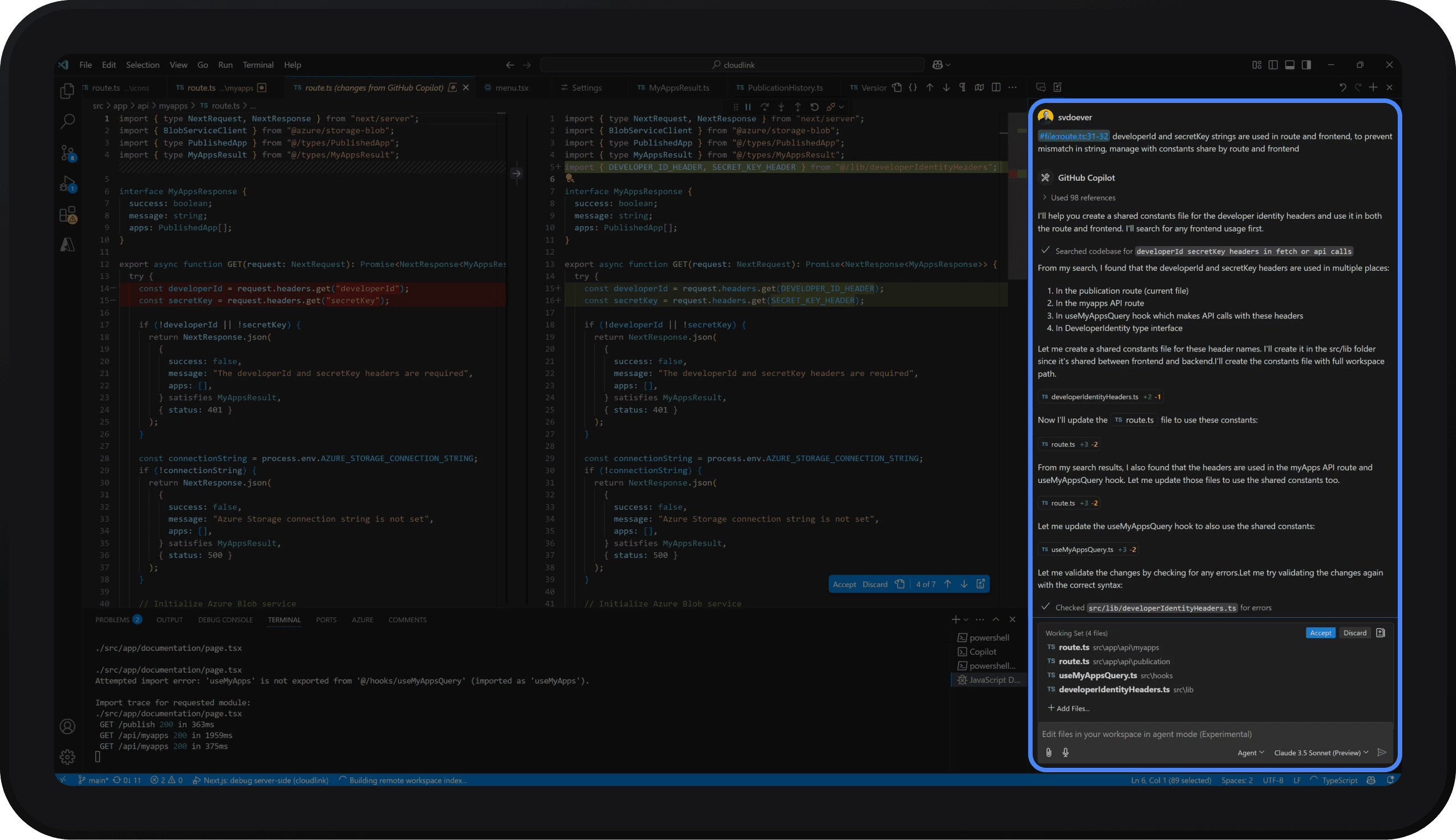
Figure 2: GitHub Copilot UI built directly into the popular IDE VS Code.
This approach remains consistent across other modalities. Voice-based assistants allow users to simply say what they want, like “Schedule a meeting tomorrow with John”, without navigating a calendar UI. ChatGPT Advanced voice and multimodal models mean such conversations can become even more nuanced and reliable. However, voice alone has limitations, Singh (2025) notes that going “voice-only” for a day was exhausting, as it demands continuous articulation and doesn’t suit every context or mood.
When users are unsure what they want, or are merely exploring, many AI products now fight “blank-prompt anxiety” by surfacing contextual suggestions and step-wise controls. Flora AI, for instance, uses a canvas-based UI that affords and encourages exploration by using nodes/boxes with branching and prompt helpers (Flora, n.d.), as seen in figure 3. By scaffolding open-ended exploration in this way, AI interfaces convert vague intent into concrete direction while preserving user agency.
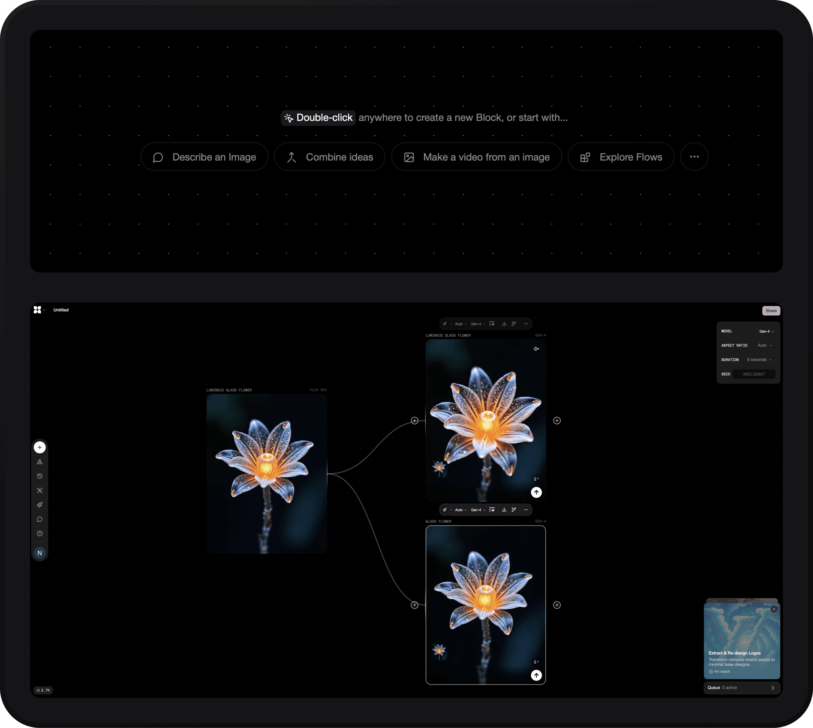
Figure 3: User interface of Flora, a visual/creative AI tool. Upon launch, the user is presented with multiple prompts (top), which can be used as a starting point for exploration (bottom).
The future likely lies in hybrid interactions where voice, text, and GUI elements complement each other. Still, the trend is clear: whether via chat, intelligent automation or voice, AI-native UIs are moving away from exposing underlying data structures and controls and instead focus on helping users accomplish goals with minimal friction.
Balancing Novelty with Predictability
Designing the future of interfaces means treading a fine line: introducing enough novelty to harness AI’s potential, but not so much that users feel lost or mistrustful. A striking observation in current AI products is how uniform and minimal many of their interfaces are. This is a deliberate strategy. “Sameness is safe, and in the world of emerging tech, safe is strategic”, writes Olena Mostepan (2025), referring to the copy-paste design trend across AI tools. When users are confronting a fundamentally new capability, a familiar interface lowers the cognitive load. The chat prompt borrows the mental model of texting or search, something users have done countless times, so they can focus on what they want the AI to do, not how to operate the UI (Mostepan, 2025).
Crucially, too much novelty in UI can backfire. If an AI product introduced a radically new interaction paradigm on top of the new technology, users might be overwhelmed. As Mostepan (2025) puts it, “innovation demands novelty, but usability depends on familiarity”. For instance, Notion AI is embedded within the existing Notion UI rather than presented as a flashy new toy. Users invoke it by typing a familiar slash command within a page (figure 4), and the AI’s responses appear inline in the document. This design makes the powerful features feel like a natural extension of Notion, “taking full advantage of [Notion’s] incredible design to make [prompting] feel natural.” (Lee, 2023). That said, designers shouldn’t shy away from all new interface ideas, the key is to introduce novelty gradually and judiciously. As users become comfortable with basic input paradigms, products can start pushing the envelope.

Figure 4: Notion AI relies on existing interaction paradigms that are already established within the software. The interface is very simple, but familiar.
Predictability in an AI-native product is inseparable from clarity: the interface must telegraph what will happen next and where new controls will surface. Adaptive UIs show how dynamic elements can enhance efficiency without disorienting users. When buttons hide, morph, or re-order, their location and affordance should remain familiar so users’ spatial memory still works; otherwise novelty feels like instability. Consistency of layout, colour, and motion cues reinforces trust, and a single, visibly focused input anchors the experience even as surrounding actions adapt. Designers should also expose multiple levels of abstraction, letting experts trigger granular controls while newcomers issue high-level intents, so people can predict outcomes whether they think in detailed steps or broad goals.
In the near future, we may see more experimental interface elements. The guiding principle is to ensure any new interaction still behaves in a predictable way. Users should be able to form reliable mental models: knowing when the AI will act, how to invoke it, and what to expect from it. Novelty for its own sake must never undermine clarity.
Feedback and Transparency
As AI becomes more autonomous, the risk is that users might feel unsure about what the system is doing or why. Feedback and transparency are thus paramount in AI-driven UIs. To foster trust, an interface should constantly communicate two things to the user: what is happening (or just happened) and why/how it happened (Eriksen, 2025). Classic usability heuristics like “visibility of system status” still apply, arguably even more strongly, in the age of AI (Eriksen, 2025). Users need to feel in control of the outcome, even if they delegated the task to an AI.
AI UIs should constantly provide feedback about the current system state. Effective progress indicators blend animation and clear text to reassure users that the system is active. For brief waits, a simple spinner with copy such as “Generating draft…” can suffice, but once delays exceed a few seconds designers should switch to determinate cues that expose steps or percentages (e.g. transcribing → translating → summarising) so users can see where the time is going (Sherwin, 2020). By considering what the user might be doing whilst waiting for the AI, Deep Research mode in ChatGPT executes progress indication well, as seen in figure 5. Where possible, add an ETA, research shows explicit time estimates reduce user anxiety (Rosala, 2019). Finally, progressive disclosure, first showing a low-resolution preview, then swapping in a high-fidelity render, keeps users engaged and gives them a chance to abort, preserving both patience and resources.

Figure 5: Progress indicator in ChatGPT during Deep Research. This process takes time and consists of multiple steps. The user is able to follow along, and even stay updated on their phone via Live Activities on iOS.
However, feedback is a two-way street. Not only should the system inform the user, but the user must be able to give feedback to the system, and good AI-native UIs give clear indications of AI actions. For example, after an AI generates content or executes a command, the result might be highlighted or accompanied by a subtle label. Gemini in Google Workspace, when it produces an answer or a paragraph, immediately offers controls for the user to accept or reject that output, shown in figure 6. This not only lets the user decide whether to keep the AI’s contribution, but also reassures them that nothing is applied irreversibly without their consent. Response feedback serves a dual purpose, it reassures the user that the developers care about quality, and it gives the user a small sense of agency. Such mechanisms embody a critical mindset: AI suggestions are proposals, not commands, and the human is still the ultimate decision-maker.

Figure 6: Gemini in Google Workspace uses two user feedback mechanisms: refining, and rating the output.
Transparency also means explaining or exposing a bit of the AI’s “thinking” when appropriate, making it clear why the AI made a decision. Since an AI may use hidden data or heuristics, the interface should surface relevant context so the user isn’t left guessing. The search tool Perplexity is notable for this. When it returns an answer, it doesn’t do so in a black-box manner, instead it returns answers with in-line citations. In practice, similar systems should cite the reference material that the answer is based on. By giving users a trail to follow, the UI increases hallucination confidence: the user can verify and understand how the AI arrived at its output. Users are more forgiving of AI errors when they can see the rationale and correct it. Indeed, Nielsen (2023) cautions that when people “don’t know how something was done, it can be harder for them to identify or correct the problem”. Hidden behaviour might wow users in demos, but in daily use it can erode trust.
Communicating that an AI has genuinely grasped a request is almost as critical to trust as the eventual result. Conversational assistants borrow a page from human active-listening, paraphrasing the user’s intent before acting (e.g. “Sure, here are some hotel options”) a technique shown to boost perceived understanding and confidence in the system (Lau, 2023). Multimodal experiences complicate that handshake: when a user shares an image or video they cannot easily tell what the AI perceives that image to be, unlike in human communication where we all see the same thing. Products such as Google Lens cope by overlaying bounding boxes and lightweight labels on the detected object while the search runs, so users can instantly confirm that the AI is “looking” at the right thing, as shown in figure 7. Emerging patterns propose heat-map previews, tap-to-highlight regions, or transient “what-I-see” ghost layers that flash before the model answers, giving people a chance to nudge the AI’s focus. Developing such visual acknowledgements will be essential for multimodal assistants.
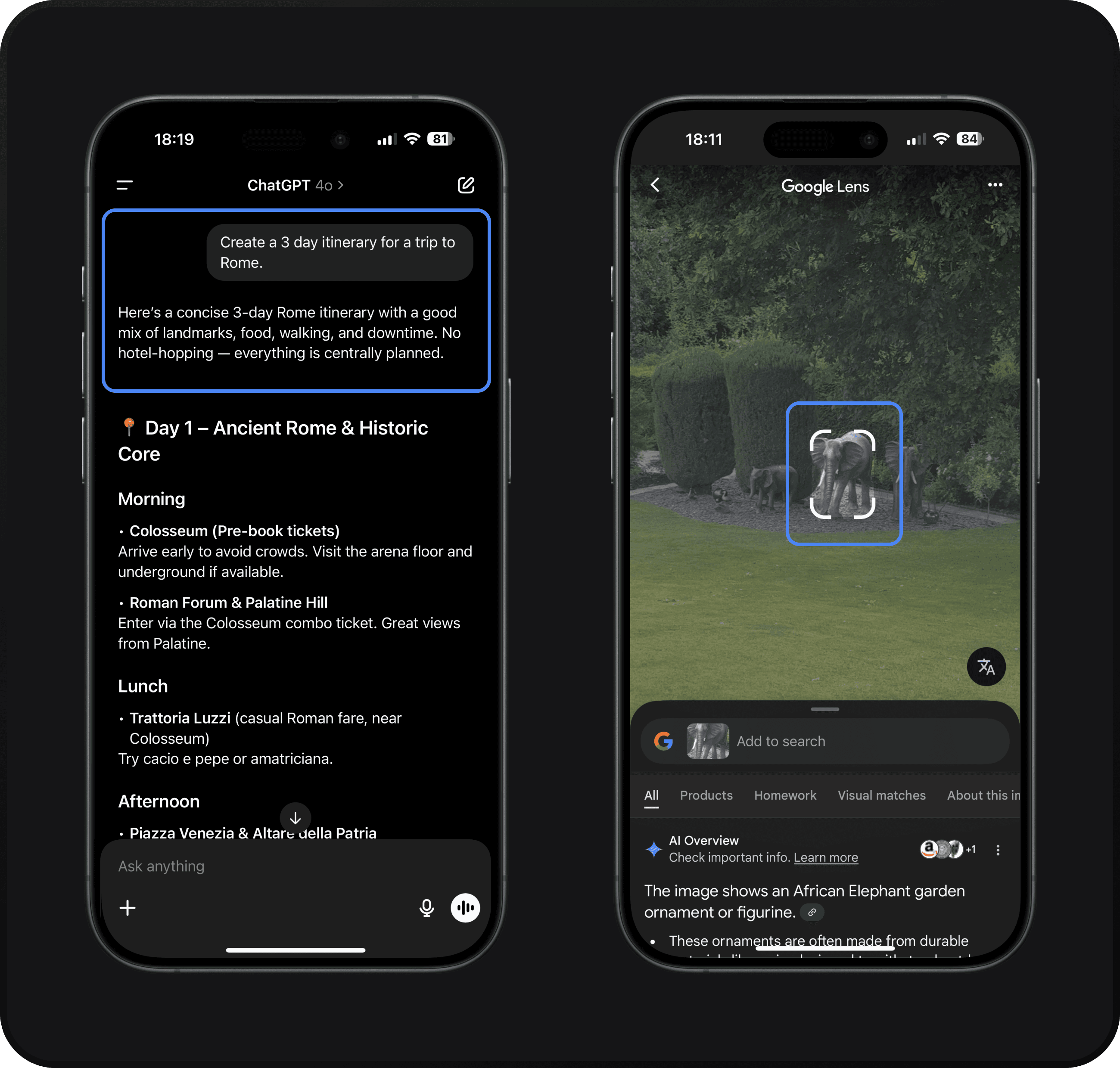
Figure 7: Two AI’s communicating understanding of user request, through text (left) and bounding boxes (right).
Ultimately, designing for transparency means accepting that AI systems have probabilistic and sometimes unpredictable natures, and making that visible and manageable for the user. This could even mean inventing new UI conventions: how do you display an AI’s confidence level or uncertainty? How do you indicate that an answer might be incomplete or speculative? How do you communicate prompt adherence? These questions are prompting innovation in interface design.
Fidelity vs. Immediacy: Controlled Illusions
Generative AI processes take time, which leads to a tradeoff between fidelity (how good the output is) and immediacy (how quickly the output is returned). Designers should determine which to prioritise based on context, and sometimes stage the experience so it feels fast and ends up high-quality.
Model choice is often the first lever. Google’s new Gemini 2.5 family illustrates how providers now publish separate variants for speed-sensitive versus quality-sensitive jobs: Flash is optimised for “high-volume, latency-sensitive tasks”, while Pro is recommended for “high-complexity reasoning” or richer multimedia outputs, even if responses take longer (Google, 2025). Product teams should therefore map user stories to model tiers.
In creative workflows, it is important to find a balance between fidelity and immediacy. For example, avatar video generation platforms such as Argil AI render the output in a low-fidelity draft (seen with a blurred overlay in figure 8), which allows the user to make changes quickly (Y Combinator, 2025). Only once the user is satisfied is the high resolution, computationally heavy video processed, saving both user patience and GPU bills. Interleaving quick feedback loops with inexpensive refinement removes a common pain point: waiting minutes for a perfect render only to discover an error.

Figure 8: Argil AI, an avatar video generation tool, uses low-fidelity previews with a blur to enable faster iterations.
Conversely, some queries demand slower, multi-step orchestration because correctness trumps speed. OpenAI’s Deep Research mode in ChatGPT plans and executes web searches, source evaluation and summarisation in the background; answers take 5-30 minutes, but users get a citation-rich report suitable for due-diligence or academic work (Lawler, 2025). Interface copy and progress bars manage expectations so that a longer wait is interpreted as “thorough, not broken”.
In voice-enabled use-cases, designing initially for fidelity becomes paramount, because even a 600 ms delay can shatter the illusion of natural conversation. Voice pipelines therefore cheat, by streaming the first token from a speed-optimised model, then back-fill with higher-quality synthesis. OpenAI’s Realtime API streams audio outputs as they’re generated and auto-handles interruptions, making dialogues feel live (OpenAI, 2024). ElevenLabs recommends its Flash TTS models and streaming to cut “time-to-first-byte”, noting that chunking plus pre-roll fillers or micro-pauses can mask longer back-end processing (ElevenLabs, 2025). Human-computer-interaction studies even show that synthetic “um… let me see” fillers measurably reduce perceived wait times for 8-16 second delays (Abbas et al., 2021, 2-14), a reminder that illusion management is an important part of product design.
In practice, teams rarely favour fidelity or immediacy outright, they layer them. Light models or previews keep the human-AI interaction snappy, while heavyweight reasoning or high-resolution passes run once the user signals commitment. The decision lies in choosing the break-points, and in signalling them clearly, so that users feel in the loop even when the system is quietly working overtime in the background.
Conclusion: Designing for an AI-First Future
The rise of AI-native user interfaces represents a profound shift in interface design, arguably the biggest since the advent of mobile touchscreens. We are moving into an era where the interface is less about controls and more about possibilities: software can already generate content and perform complex actions on behalf of the user.
Looking ahead, we can expect AI to enable experiences that are more adaptive and context-aware than ever. But even in such futures, users will always need clarity, predictability, and a sense of mastery over their tools. As we design the next generation of AI-native products, success will come from marrying machine intelligence with human-centered design, achieving true human-machine-collaboration. The interfaces of the future should feel like natural extensions of our intentions, empowering us to do more, with less effort. For designers and product builders, the challenge is to harness this power without overwhelming or alienating people.
Never miss an Insight.
Sign up to our mailing list to receive our blog posts directly in your inbox.
Insights.
Thought leadership and updates from Sans Studio.